Visualizing and modeling relationships IV

Lecture 13

Dr. Mine Çetinkaya-Rundel

Duke University
STA 113 - Fall 2023

Warm-up

Announcements

  • HW 4 posted, due next Thursday
  • Project 2 proposals are due next Tuesday by class time. Peer review in class (make sure to arrive on time!). (Optional) updated proposals due next Friday.

Today’s goals

  • Finish visualizing decision boundaries for classification models

  • Define sensitivity, specificity, and ROC curves

Logistic regression

ae-11-spam

Ultimate goal: Recreate the following visualization.

ae-11-spam

Reminder of instructions for getting started with application exercises:

  • Go to the course GitHub org and find your ae-11-spam (repo name will be suffixed with your GitHub name).
  • Click on the green CODE button, select Use SSH (this might already be selected by default, and if it is, you’ll see the text Clone with SSH). Click on the clipboard icon to copy the repo URL.
  • In RStudio, go to FileNew ProjectVersion ControlGit.
  • Copy and paste the URL of your assignment repo into the dialog box Repository URL. Again, please make sure to have SSH highlighted under Clone when you copy the address.
  • Click Create Project, and the files from your GitHub repo will be displayed in the Files pane in RStudio.
  • Click ae-11-spam.qmd to open the template Quarto file. This is where you will write up your code and narrative for the lab.

Evaluating predictive performance

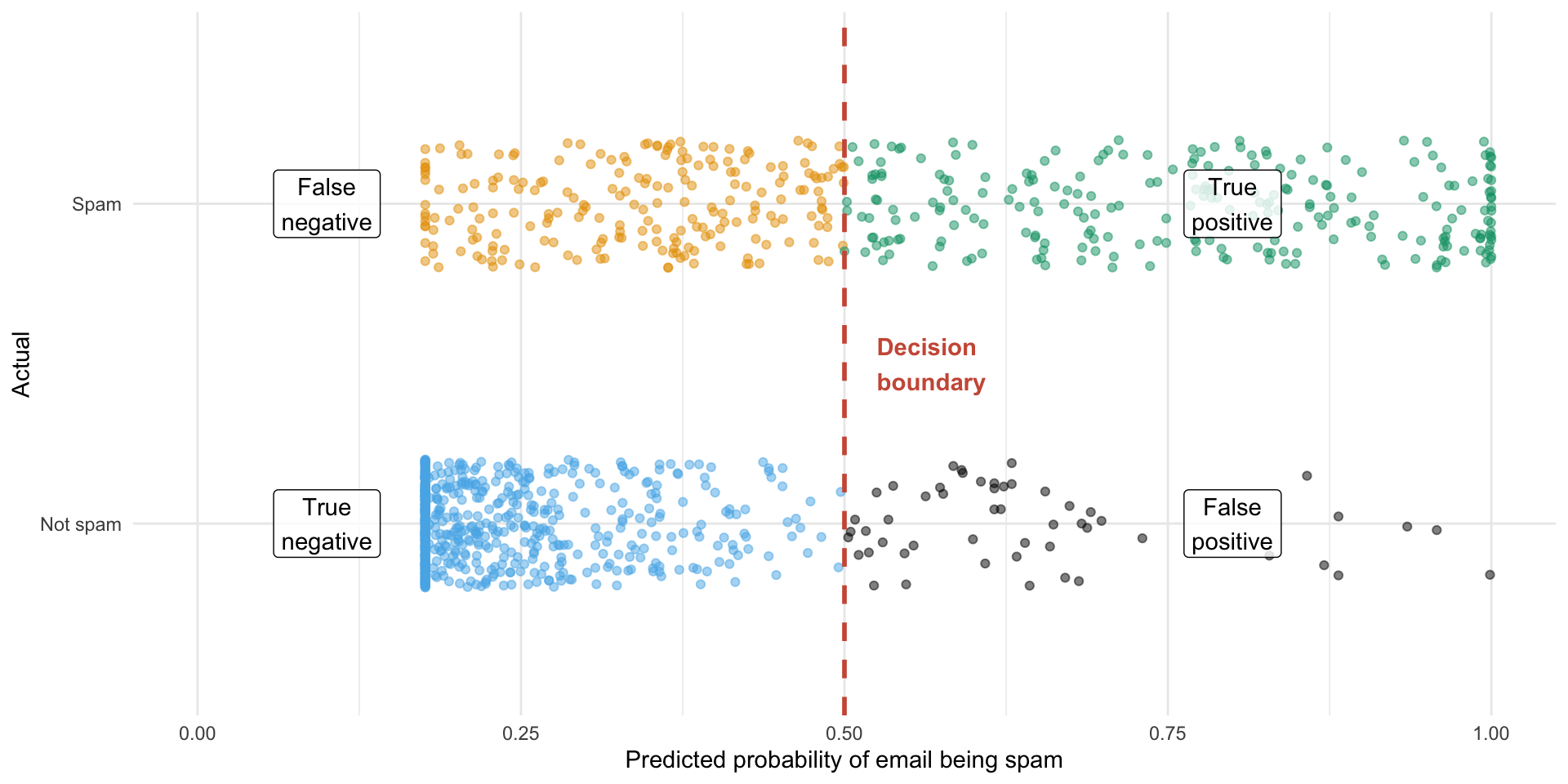
Sensitivity and specificity

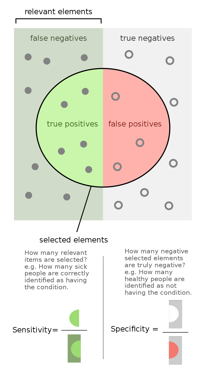
  • Sensitivity is the true positive rate – is the probability of a positive prediction, given positive observed.

  • Specificity is the true negative rate - is the probability of a negative test result given negative observed.

Source: Wikipedia

Visualizing sensitivity and specificity

  • The plot we created earlier displays sensitivity and specificity for a given decision bound.

  • An alternative display can visualize various sensitivity and specificity rates for all possible decision bounds.
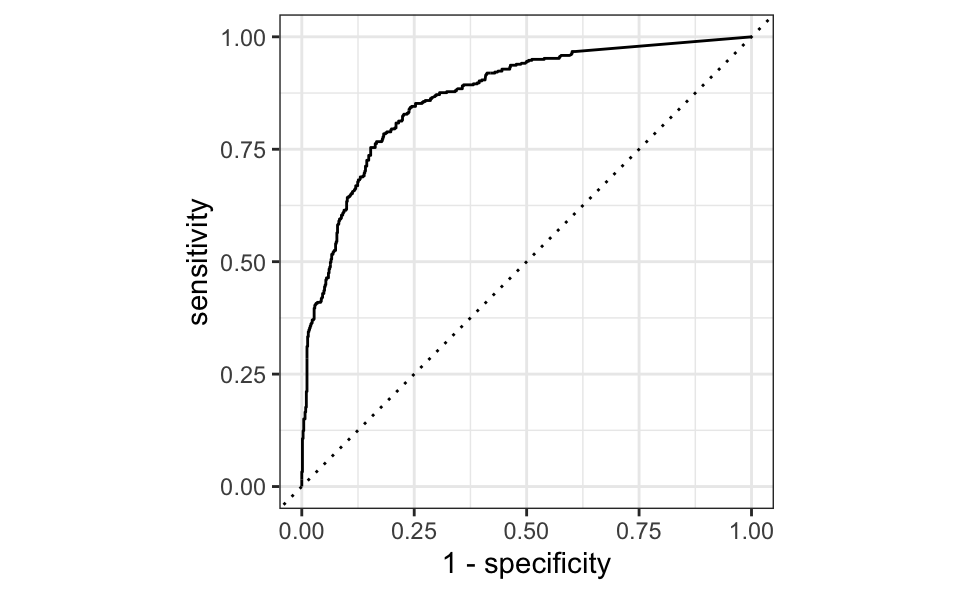
ROC curves

Receiver operating characteristic (ROC) curve+ plot true positive rate vs. false positive rate (1 - specificity).

my_model_aug |>
  roc_curve(
    truth = type,
    .pred_1,
    event_level = "second"
  ) |>
  autoplot()

Area under ROC curve

Do you think a better model has a large or small area under the ROC curve?

my_model_aug |>
  roc_auc(
    truth = type,
    .pred_1,
    event_level = "second"
  )
# A tibble: 1 × 3
  .metric .estimator .estimate
  <chr>   <chr>          <dbl>
1 roc_auc binary         0.870