25:00
Presentation ready plots 2:
Telling a story
Lecture 19
Complete themes
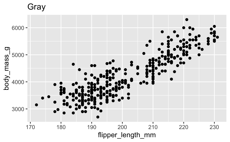
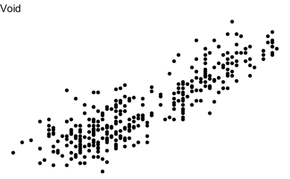
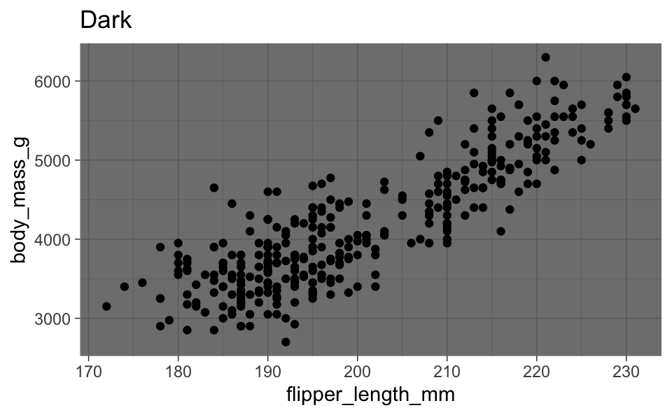
Themes from ggthemes
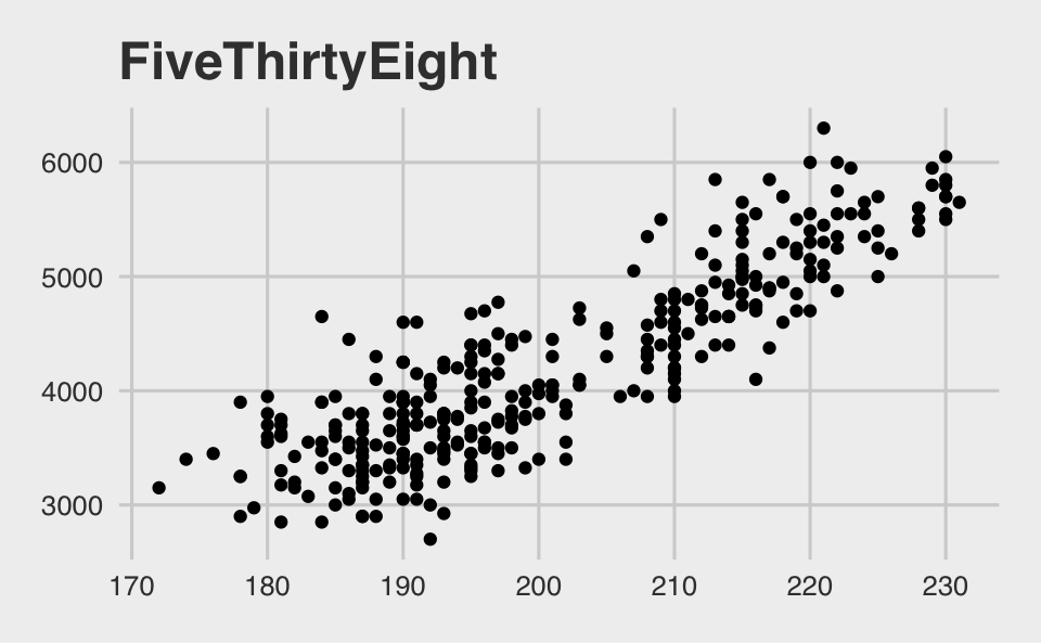
Themes and color scales from ggthemes
Modifying theme elements
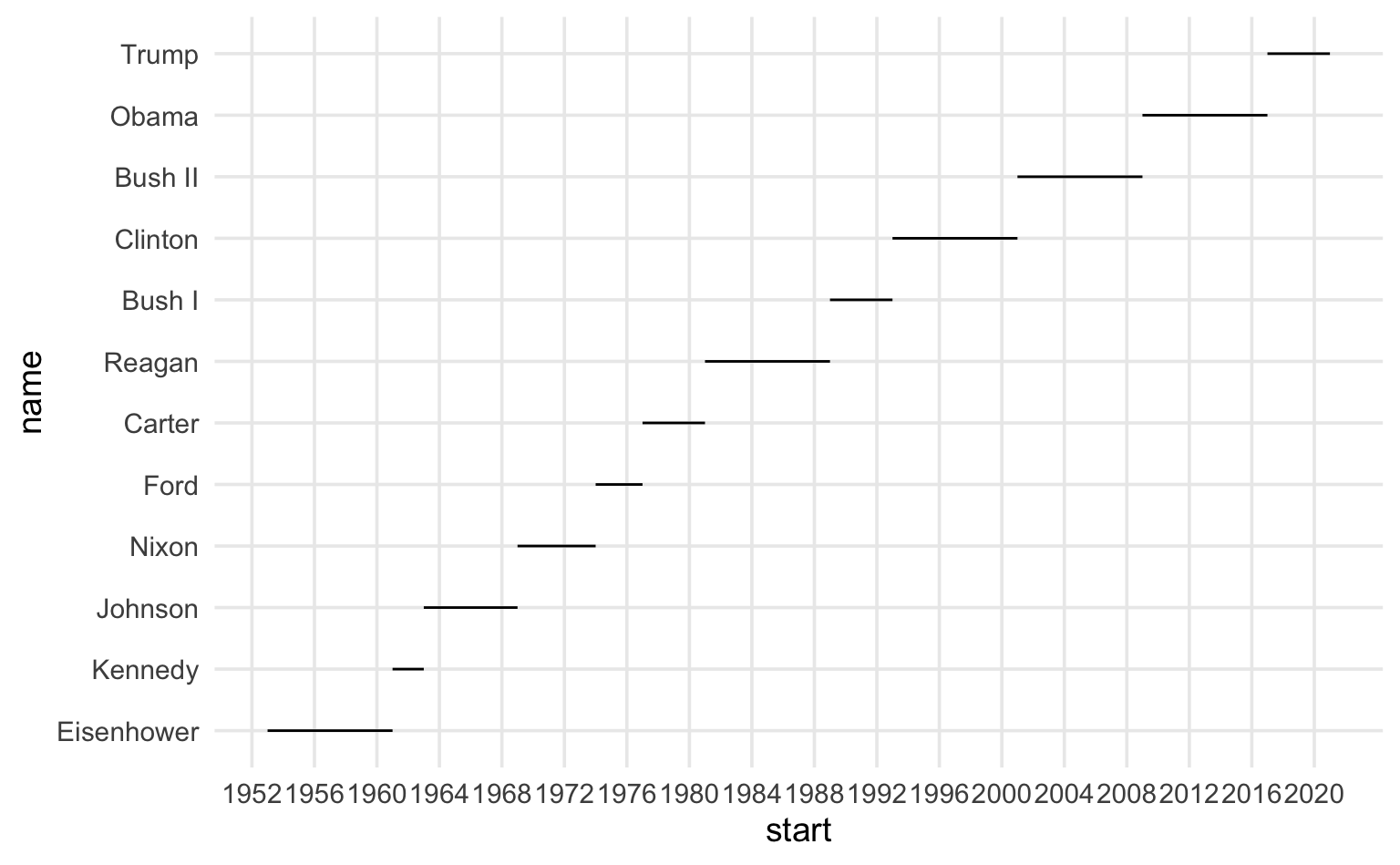
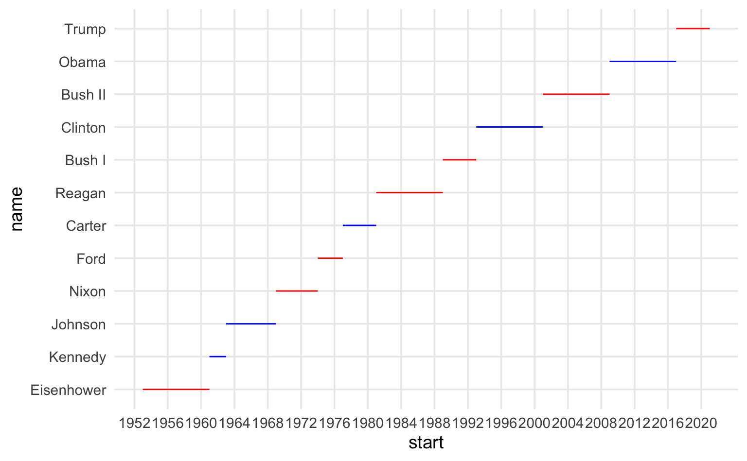
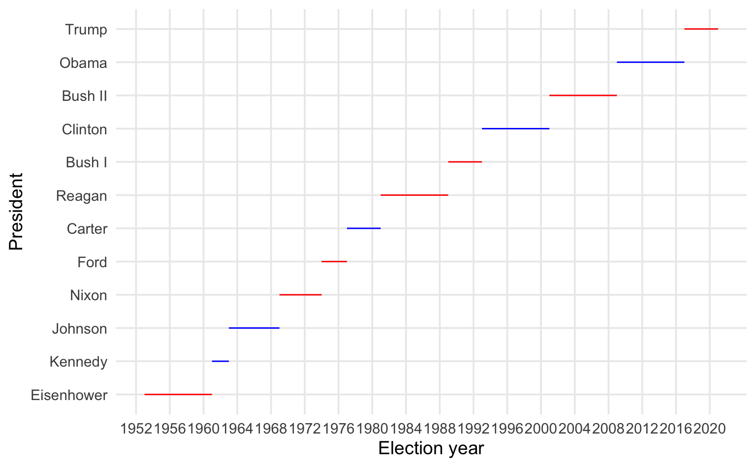
Presidential terms
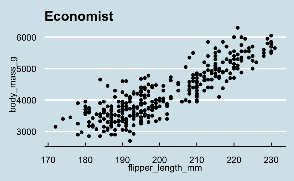
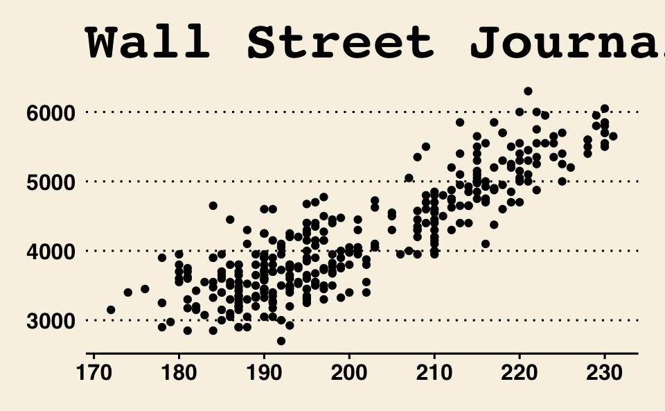
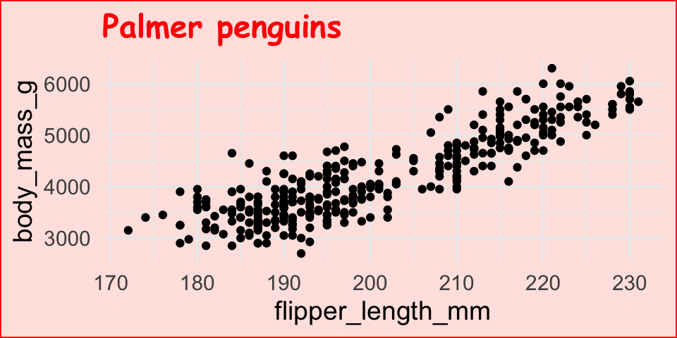
How can the following figure be improved with custom breaks in axes, if at all?
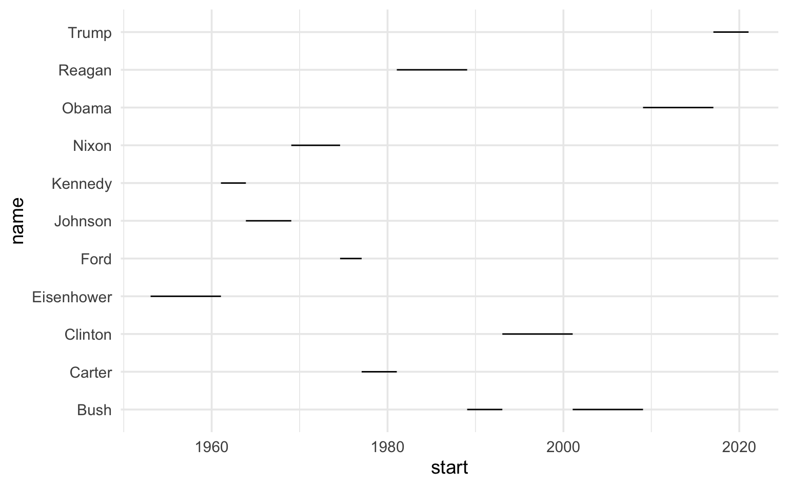
# A tibble: 12 × 4
   name       start      end        party
   <chr>      <date>     <date>     <chr>
 1 Eisenhower 1953-01-20 1961-01-20 Republican
 2 Kennedy    1961-01-20 1963-11-22 Democratic
 3 Johnson    1963-11-22 1969-01-20 Democratic
 4 Nixon      1969-01-20 1974-08-09 Republican
 5 Ford       1974-08-09 1977-01-20 Republican
 6 Carter     1977-01-20 1981-01-20 Democratic
 7 Reagan     1981-01-20 1989-01-20 Republican
 8 Bush       1989-01-20 1993-01-20 Republican
 9 Clinton    1993-01-20 2001-01-20 Democratic
10 Bush       2001-01-20 2009-01-20 Republican
11 Obama      2009-01-20 2017-01-20 Democratic
12 Trump      2017-01-20 2021-01-20 Republican
Context matters: y-axis breaks
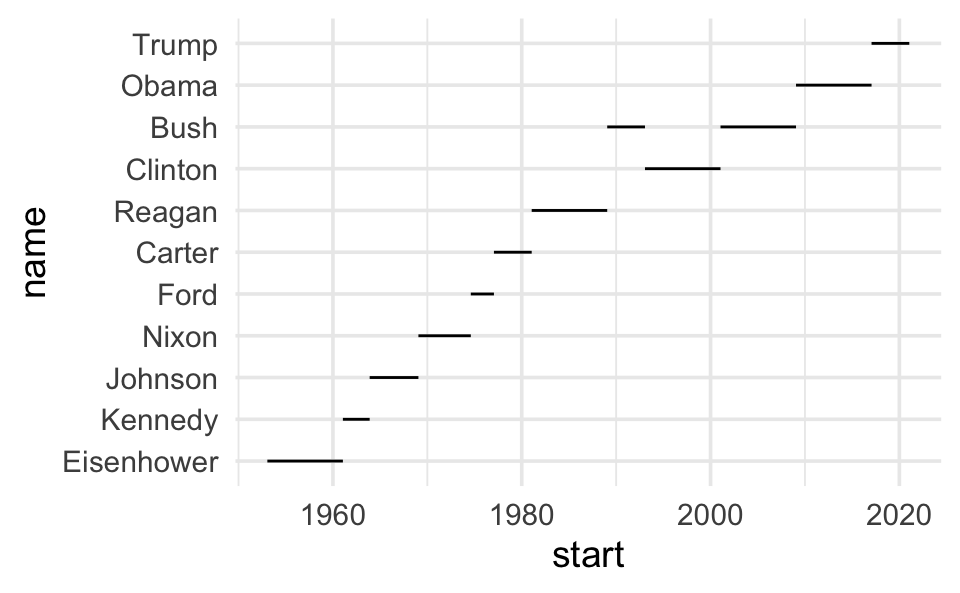
Context matters: y-axis breaks
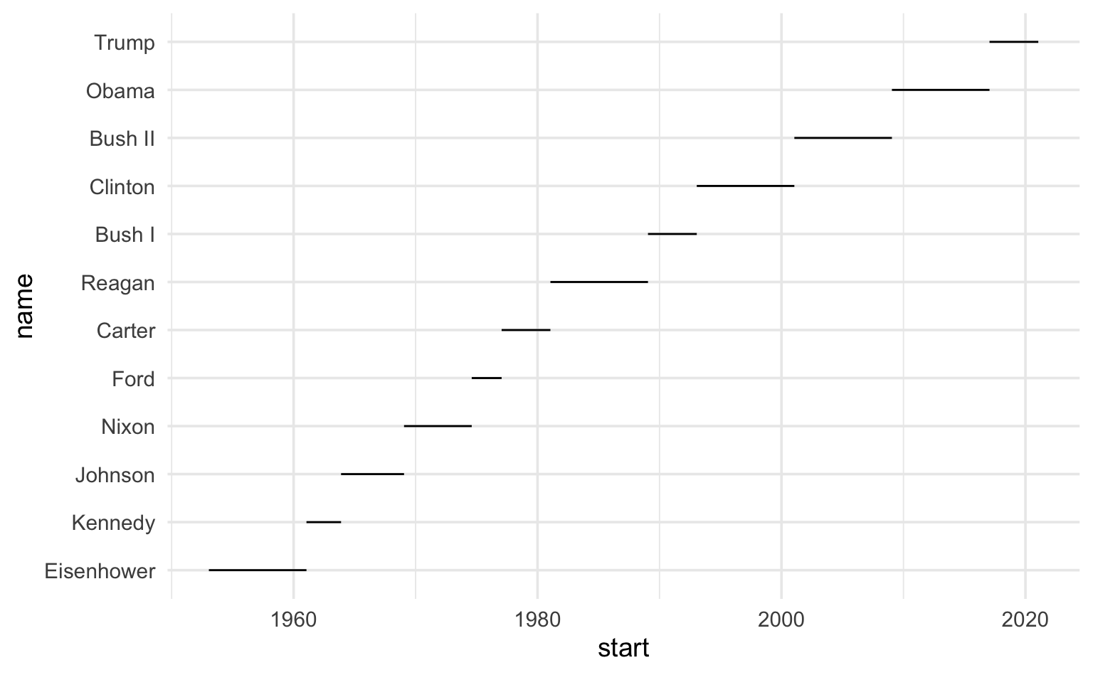
Context matters: x-axis breaks
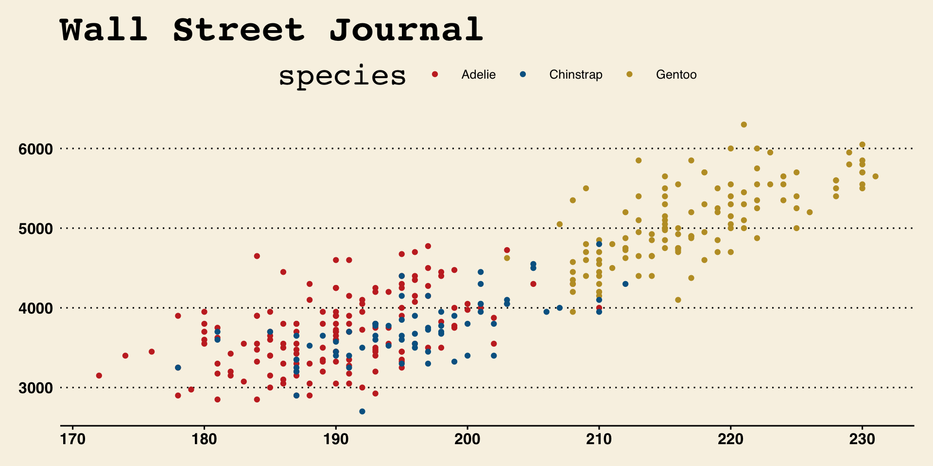
Colors matter
Precision matters
Why annotate?
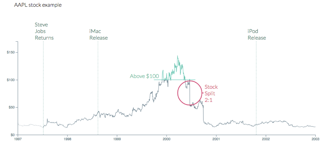
geom_text()
Can be useful when individual observations are identifiable, but can also get overwhelming…
How would you improve this visualization?
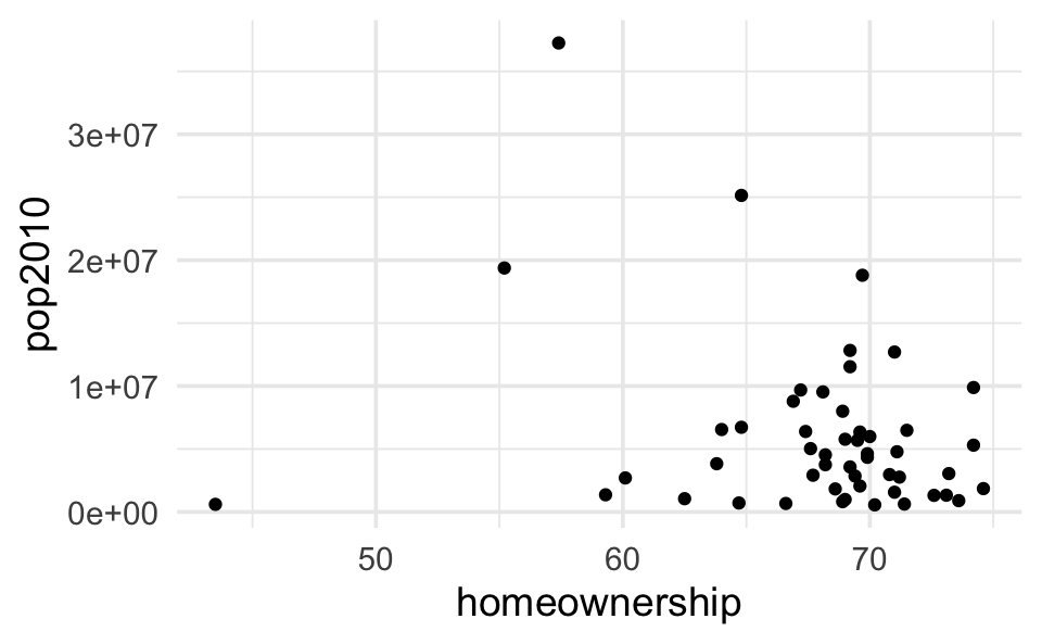
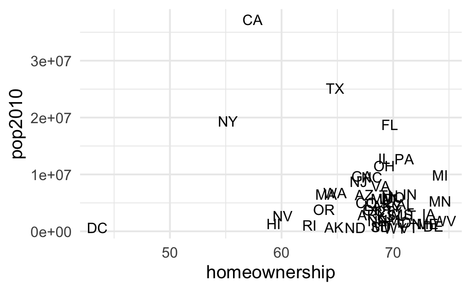
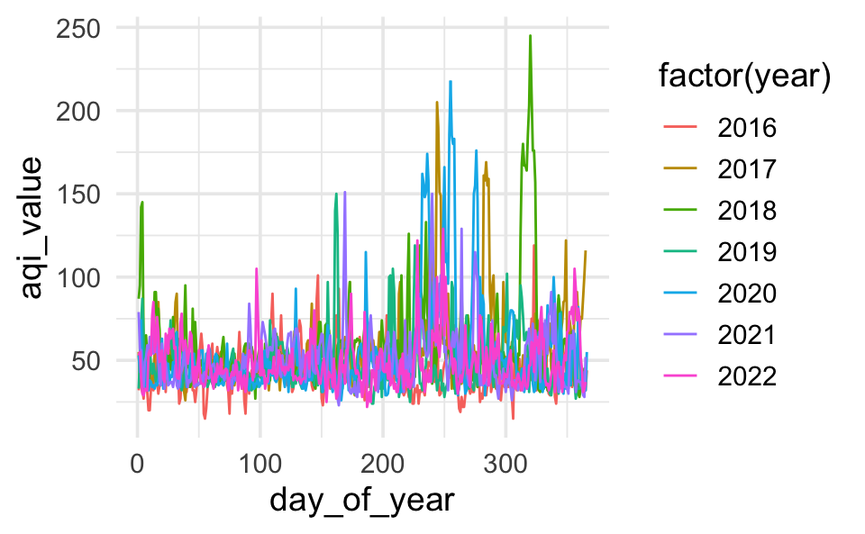
All of the data doesn’t tell a story


Plot AQI over years
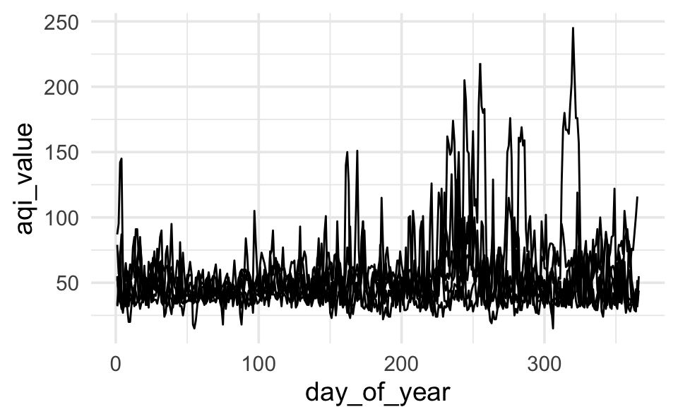
Plot AQI over years
Plot AQI over years
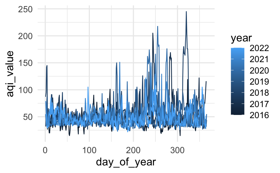
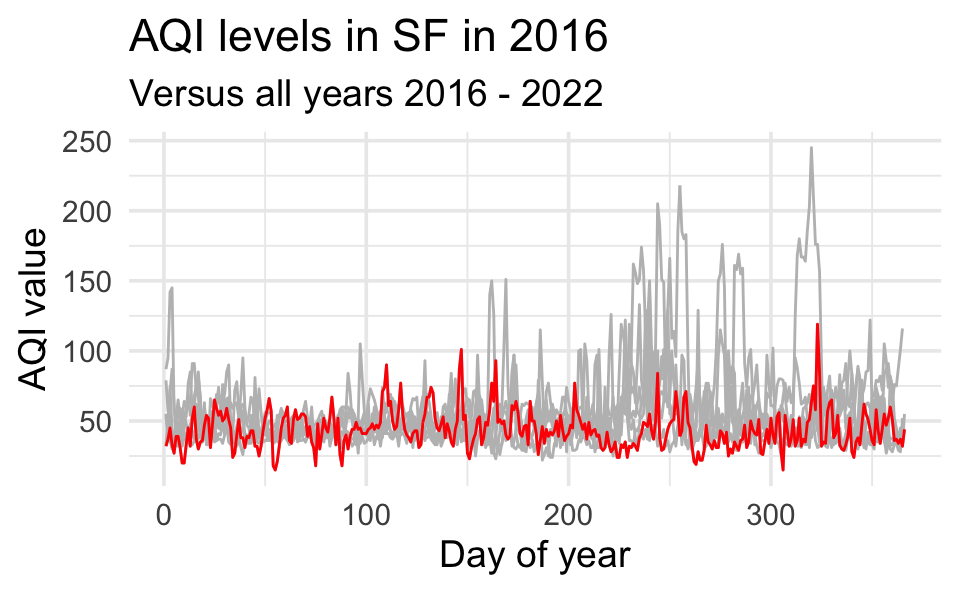
Highlight 2016
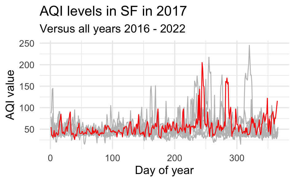
Highlight 2017
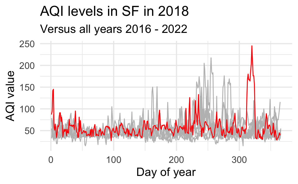
Highlight 2018

Highlight any year
year_to_highlight <- 2018

ggplot(sf, aes(x = day_of_year, y = aqi_value, group = year)) +
  geom_line(color = "gray") +
  geom_line(data = sf |> filter(year == year_to_highlight), color = "red") +
  labs(
    title = glue("AQI levels in SF in {year_to_highlight}"),
    subtitle = "Versus all years 2016 - 2022",
    x = "Day of year", y = "AQI value"
    )
Quarto tips
Figures and tables
Cross references
Bibliography
Slides