library(tidyverse)
library(dsbox)
library(babynames)
library(nycflights13)HW 2
Important
This homework is due Thursday, Sep 21 at 5:00 pm ET.
Getting Started
Go to the sta113-f23 organization on GitHub. Click on the repo with the prefix
hw-2. It contains the starter documents you need to complete the homework assignment.Clone the repo and start a new project in Posit Cloud.
Do the necessary things for setting up a PAT make sure it persists:
- In the Console, run
usethis::create_github_token()to create a new PAT or grab the one you created previously from a space you might have safely stored it (e.g., 1Password or similar) - In the Console, run
gitcreds::gitcreds_set()and paste your PAT when prompted. - In the Terminal, run
git config credential.helper storeto make sure your PAT persists throughout the whole time you’re working on this assignment / Cloud project.
- In the Console, run
Packages
Guidelines + tips
As we’ve discussed in lecture, your plots should include an informative title, axes should be labeled, and careful consideration should be given to aesthetic choices.
Remember that continuing to develop a sound workflow for reproducible data analysis is important as you complete this homework and other assignments in this course. There will be periodic reminders in this assignment to remind you to knit, commit, and push your changes to GithHub. You should have at least 3 commits with meaningful commit messages by the end of the assignment.
Note
Note: Do not let R output answer the question for you unless the question specifically asks for just a plot. For example, if the question asks for the number of columns in the data set, please type out the number of columns. You are subject to lose points if you do not.
Workflow + formatting
Make sure to
- Update author name on your document.
- Label all code chunks informatively and concisely.
- Follow the Tidyverse code style guidelines.
- Make at least 3 commits.
- Resize figures where needed, avoid tiny or huge plots.
- Use informative title and axis labels.
- Turn in an organized, well formatted document.
Exercises
Read traffic accidents in Edinburgh
The data for Exercises 1-5 are available online by the UK Government. It covers all recorded accidents in Edinburgh in 2018 and some of the variables were modified for the purposes of this assignment. The data can be found in the dsbox package, and it's called accidents. You can find out more about the dataset by inspecting its documentation with ?accidents and you can also find this information here.
Exercise 1
Make a histogram of the times of road accidents, using 24 bins so that each bin represents (roughly) an hour. Based on this histogram, what are common times of the day that road accidents occur in Edinburgh?
Exercise 2
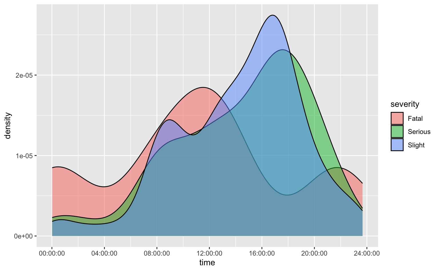
Recreate the following visualization. Describe, in one sentence, what additional information you can glean from this visualization compared to the previous one from Exercise 1.
Hint: To match the transparency level of the density curves, you can use alpha = 0.5.
Exercise 3
Create a new variable in the accidents data frame called day_of_week_type which takes the value "Weekend" if day_of_week is Saturday or Sunday, and "Weekday" otherwise. Assign the resulting data frame to accidents, overwriting the original data frame with the new one including the days_of_week_type variable. Print the new accidents data frame, relocating the day_of_week_type and day_of_week to the beginning of the data frame. Spot check that the values of the day_of_week_type have been created correctly.
Exercise 4
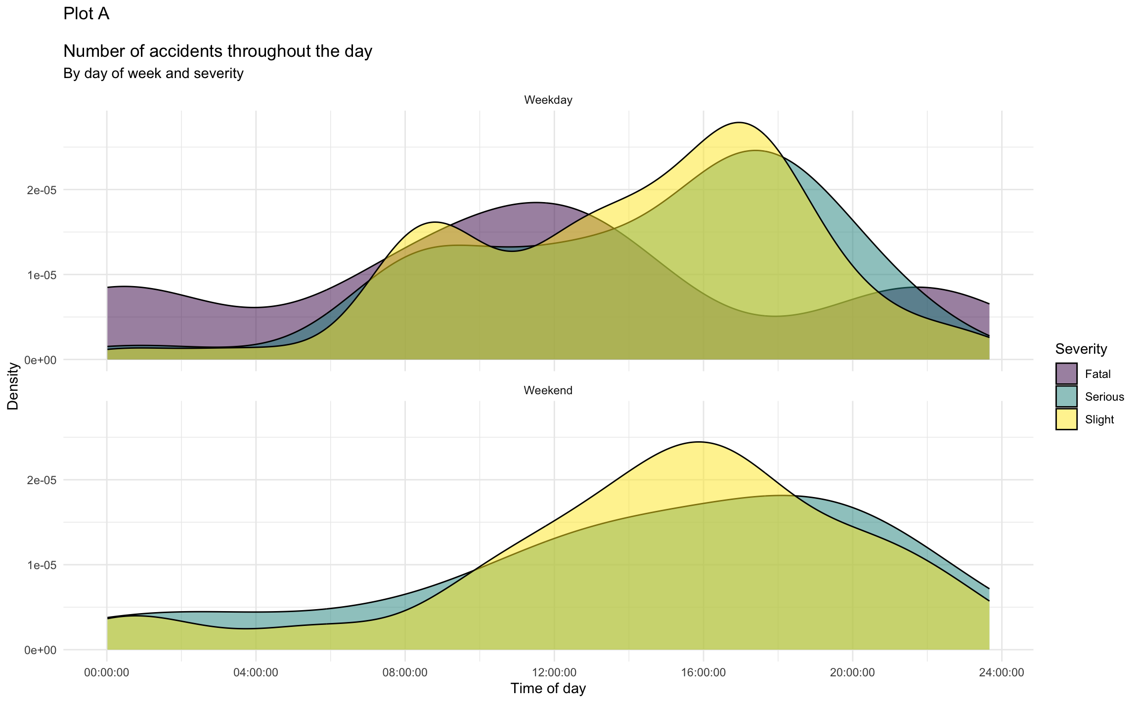
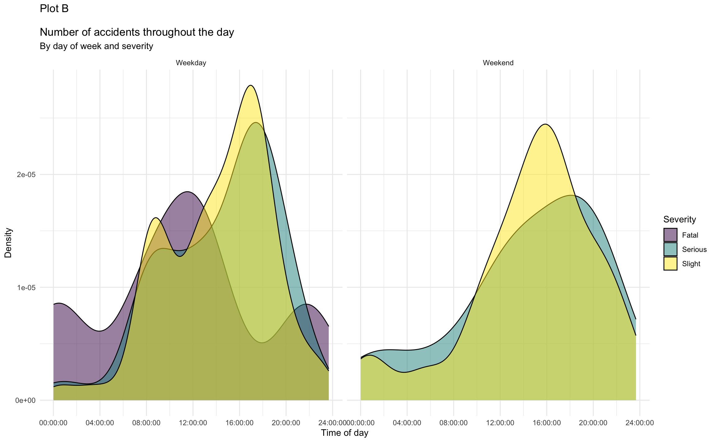
The following two visualizations were created by taking the visualization from Exercise 2 and faceting it by the new variable, day_of_week_type. Which plot (Plot A or Plot B) is better for comparing the density and severity of road accidents throughout the day in Edinburgh. Explain your reasoning.
Exercise 5
Recreate the visualization you chose in Exercise 4.
Hint: The plot uses the viridis color scale.
Now is a good time to render, commit, and push. Make sure that you commit and push all changed documents and your Git pane is completely empty before proceeding. You can use a commit message like “Finished Part 1”.
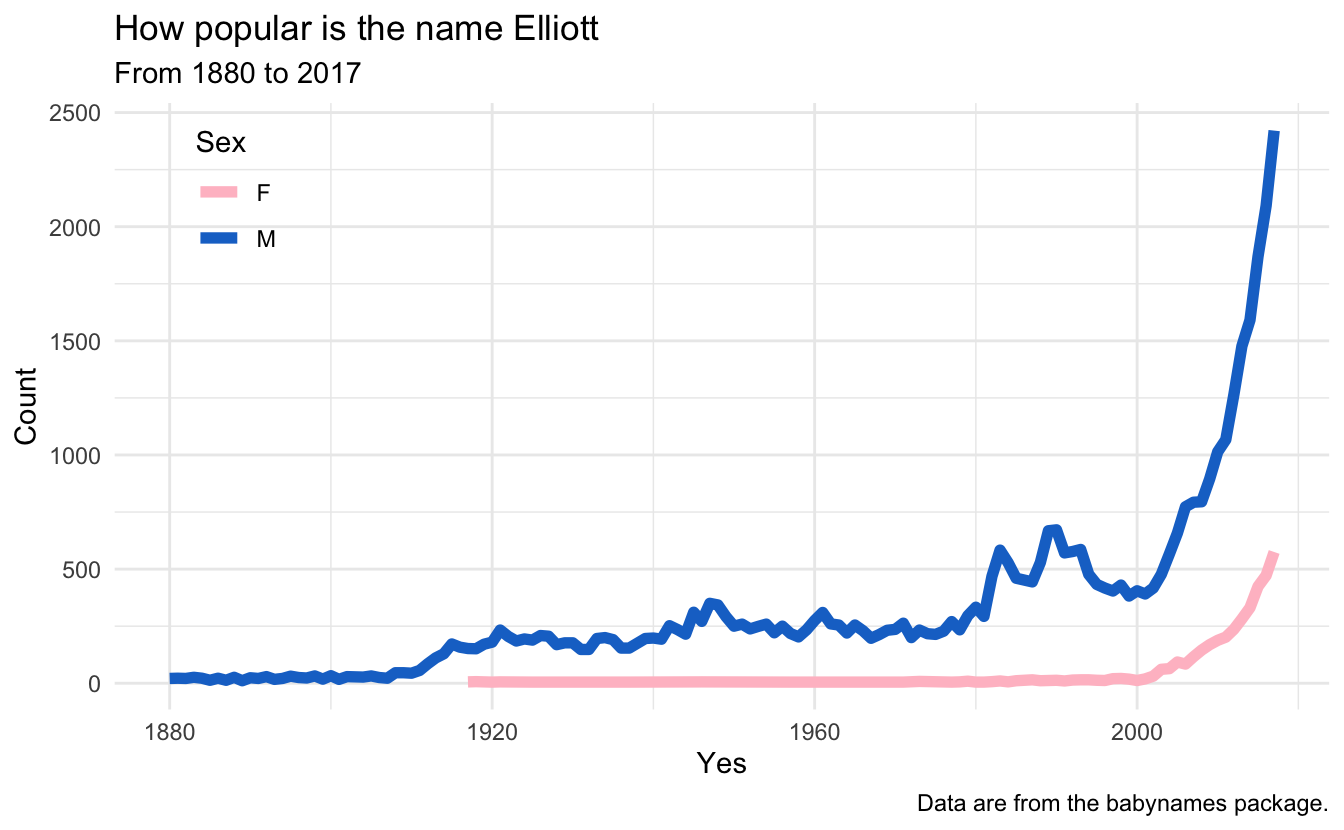
Babynames
The data for Exercises 6-9 come from the babynames package. The name of the data frame you’ll use is babynames, which contains the number of children of each sex given each name, for each year from 1880 to 2017. All names with more than 5 uses are given.
Exercise 6
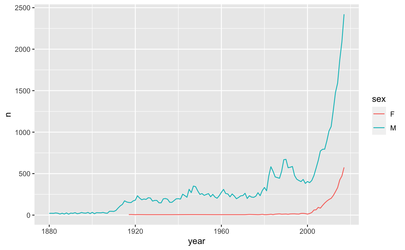
Recreate the visualization below, with one modification: instead of Elliott, use your name. Or, if your name isn’t in the dataset (like mine, pun intended), use a friend’s name or any name of your choosing. Describe the trend you observe in the plot.
Exercise 7
The following visualization displays the same information as the one in Exercise 7, except it has been enhanced in a variety of ways.
Identify and enumerate the differences between the visualization below and the one above.
Implement the updates you enumerated in part (a) to recreate a visualization below. Note: You should be updating your plot from Exercise 6, not the “Elliott” plot.
Now is again a good time to render, commit, and push, with a commit message line “Finished Part 2”. Make sure that you commit and push all changed documents and your Git pane is completely empty before proceeding.
Miscellaneous
Exercise 8
Read the docs:
Run the following code. What does it do? Or, another way to ask this question is, what does the result tell you?
flights |>
  distinct(origin, dest)
Now run the following code. How is the output different? Hint: You may need to “read the docs”, i.e., read the help documentation for
distinct(), to find out what setting the.keep_allargument toTRUEdoes.flights |> distinct(origin, dest, .keep_all = TRUE)
You know the drill: render, commit, and push!
Exercise 9
Code style: Fix up the code style and briefly describe your fixes. Then, inspect the output. This dataset was introduced in your reading. Briefly describe what this code does.
Hint: You can refer to the Tidyverse style guide.
flights|>group_by(dest)|>summarize(MEAN.Arrival_delay=mean(arr_delay, na.rm = TRUE))|>arrange(desc(MEAN.Arrival_delay))Render, commit, and push one last time.
Make sure that you commit and push all changed documents and your Git pane is completely empty before proceeding.
Wrap up
Review
Before you call it “done”,
- make sure you’ve answered all questions (or, at least, have not skipped any accidentally) and
- review the Section 1.2 section and make any edits/corrections needed.
You can change answers to exercises you’ve “completed” and commit and push again. We will only grade the final version of your assignment. You can commit and push as many times as you like until the deadline.
Submission
You do not have to do anything special to “submit” your assignment. We will close the repos to further pushes at the deadline, and will take your work as of that time point as your submission.
If you need to submit late for any reason, contact the professor.
Grading
- Exercise 1-9: 10 points each
- Workflow + formatting: 10 points
- Total: 100 points