HW 5
This homework is due Tuesday, Dec 5 at 5:00 pm ET.
Getting Started
- Go to the sta113-f23 organization on GitHub. Click on the repo with the prefix
hw-5. It contains the starter documents you need to complete the homework assignment. - Click on the green CODE button, select Use SSH (this might already be selected by default, and if it is, you’ll see the text Clone with SSH). Click on the clipboard icon to copy the repo URL.
- In RStudio, go to File ➛ New Project ➛Version Control ➛ Git.
- Copy and paste the URL of your assignment repo into the dialog box Repository URL. Again, please make sure to have SSH highlighted under Clone when you copy the address.
- Click Create Project, and the files from your GitHub repo will be displayed in the Files pane in RStudio.
- Click
hw-4.qmdto open the template Quarto file. This is where you will write up your code and narrative for the lab.
Guidelines + tips
As we’ve discussed in lecture, your plots should include an informative title, axes should be labeled, and careful consideration should be given to aesthetic choices.
Remember that continuing to develop a sound workflow for reproducible data analysis is important as you complete this homework and other assignments in this course. There will be periodic reminders in this assignment to remind you to knit, commit, and push your changes to GithHub. You should have at least 3 commits with meaningful commit messages by the end of the assignment.
Note: Do not let R output answer the question for you unless the question specifically asks for just a plot. For example, if the question asks for the number of columns in the data set, please type out the number of columns. You are subject to lose points if you do not.
Workflow + formatting
Make sure to
- Update author name on your document.
- Label all code chunks informatively and concisely.
- Follow the Tidyverse code style guidelines.
- Make at least 3 commits.
- Resize figures where needed, avoid tiny or huge plots.
- Use informative title and axis labels.
- Turn in an organized, well formatted document.
Potpourri
Exercise 1
Mirror, mirror on the wall, who’s the ugliest of them all? Make a plot of the variables in the penguins dataset from the palmerpenguins package. Your plot should use at least two variables, but more is fine too. First, make the plot using the default theme and color scales. Then, update the plot to be as ugly as possible. You will probably want to play around with theme options, colors, fonts, etc. The ultimate goal is the ugliest possible plot, and the sky is the limit!
Exercise 2
A new day, a new plot, a new geom. The goal of this exercise is to learn about a new type of plot (ridgeline plot) and to learn how to make it.
Use the geom_density_ridges() function from the ggridges package to make a ridge plot of of Airbnb review scores of Edinburgh neighborhoods. The neighborhoods should be ordered by their median review scores. The data can be found in the dsbox package, and it’s called edibnb. Also include an interpretation for your visualization. You should review feedback from your Homework 1 to make sure you capture anything you may have missed previously.
(Note: This is not a geom we introduced in class, so seeing an example of it in action will be helpful. Read the package README at https://wilkelab.org/ggridges and/or the introduction vignette at https://wilkelab.org/ggridges/articles/introduction.html. There is more information than you need for this question in the vignette; the first section on Geoms should be sufficient to help you get started.)
Exercise 3
Refer back to Exercise 9 from HW 3 and write alternative text for each of the plots. You do not need to recreate the plots for this exercise, you’re only asked for the alternative text.
Learning from others
Exercise 4
The visual uncertainty experience. Watch the video titled The visual uncertainty experience by Jessica Hullman and write a one paragraph summary of what you learned.
Exercise 5
To annotate, or not to annotate? There are two ways you can get text on a ggplot: geom_text() and annoate(geom = "text"). Which one should you use when? Hint: Watch this video titled “Always look on the bright side of plots” by Kara Woo.
Second chances
Exercise 6
A second chance for a homework assignment. Take one of the visualizations from a previous homework assignment, ideally one you received more feedback on / lost more points on and improve it. First, write one sentence reminding us of your the specific exercise and a a few sentences on why you chose this plot and how you plan to improve it. Some of these improvements might be “fixes” for things that were pointed out as missing or incorrect. Some of them might be things you hoped to do before the homework deadline, but didn’t get a chance to. Some notes for completing this exercise:
You will need to add your data from your the homework assignment to the
data/folder in this assignment. You do not need to also add the data dictionary.You will need to copy over any code needed for cleaning / preparing your data for this plot. You can reuse code from your previous assignment but note that we will re-evaluate your code as part of the grading for this exercise. This means we might catch something wrong with it that we didn’t catch before, so if you spot any errors make sure to fix them.
Don’t worry about being critical of your own work. Even if you lost no points on the plot, if you think it can be improved, articulate how / why. We will not go back and penalize for any mistakes you might point out that we didn’t catch at the time of grading your homework assignment. There’s no risk to being critical!
Exercise 7
A second chance for Project 1. TL;DR - Same as the previous exercise, but for Project 1.
Take one of the visualizations from your first project, ideally one you received more feedback on / lost more points on and improve it. First, write one sentence reminding us of your project and a a few sentences on why you chose this plot and how you plan to improve it. Some of these improvements might be “fixes” for things that were pointed out as missing or incorrect. Some of them might be things you hoped to do before the project deadline, but didn’t get a chance to. And some might be things you wanted to do in your project but your teammates didn’t agree so you gave up on at the time. Some notes for completing this exercise:
You will need to add your data from your project to the
data/folder in this assignment. You do not need to also add the data dictionary.You will need to copy over any code needed for cleaning / preparing your data for this plot. You can reuse code from your project but note that we will re-evaluate your code as part of the grading for this exercise. This means we might catch something wrong with it that we didn’t catch before, so if you spot any errors make sure to fix them.
Don’t worry about being critical of your own work. Even if you lost no points on the plot, if you think it can be improved, articulate how / why. We will not go back and penalize for any mistakes you might point out that we didn’t catch at the time of grading your project. There’s no risk to being critical!
Wild-caught plots
This part features “wild-caught plot”s. These are examples of good or bad plots made by someone else.
Exercise 8
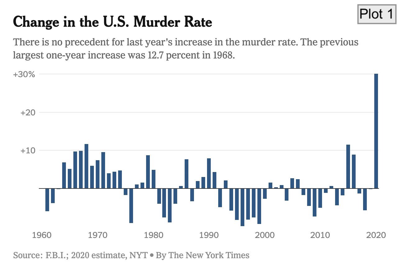
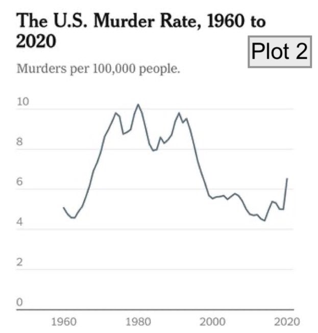
Murder rates. The following plots visualizing the same data, quite differently. Determine if each of the statements is true or false about how the two plots compare. If false, explain your reasoning.
Plot 1 shows rate of change in murders from one year to the next, while Plot 2 shows the rate of murders per 100,000 people.
Plot 2 makes it easier to see the trend in murder rates over the years while Plot 1 makes it easier to see yearly changes in murder rates.
When the values in Plot 1 increase, those in Plot 2 decrease.
The spike after 2020 appears much bigger in Plot 1 compared to Plot 2.
Exercise 9
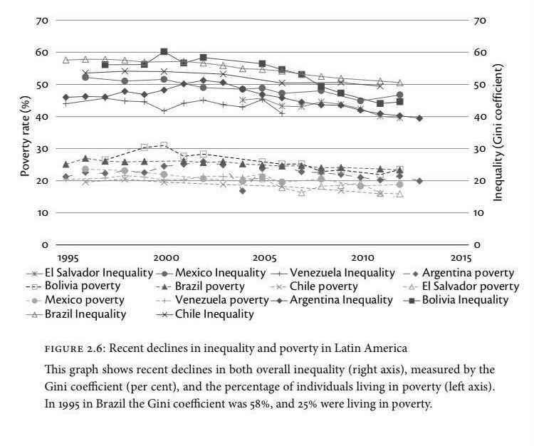
Inequality. The plot below comes from the book titled Inequality by Anthony B. Atkinson. Determine if each of the statements is true or false about how the two plots compare. If false, explain your reasoning.
Each line represents a distinct country.
The plot shows how for each country poverty turns into inequality over time.
There is a negative relationship between poverty rate and inequality in the countries shown.
Poverty rate is higher than inequality in each of the countries shown.
Wrap up
Review
Before you call it “done”,
- make sure you’ve answered all questions (or, at least, have not skipped any accidentally) and
- review the Section 1.1 section and make any edits/corrections needed.
You can change answers to exercises you’ve “completed” and commit and push again. We will only grade the final version of your assignment. You can commit and push as many times as you like until the deadline.
Submission
You do not have to do anything special to “submit” your assignment. We will close the repos to further pushes at the deadline, and will take your work as of that time point as your submission.
If you need to submit late for any reason, contact the professor.
Grading
- Exercise 1-9: 10 points each
- Workflow + formatting: 10 points
- Total: 100 points