library(tidyverse)
library(tidymodels)
library(scales)
library(openintro)HW 3
Important
This homework is due Thursday, Oct 26 at 5:00 pm ET.
Getting Started
- Go to the sta113-f23 organization on GitHub. Click on the repo with the prefix
hw-3. It contains the starter documents you need to complete the homework assignment. - Click on the green CODE button, select Use SSH (this might already be selected by default, and if it is, you’ll see the text Clone with SSH). Click on the clipboard icon to copy the repo URL.
- In RStudio, go to File ➛ New Project ➛Version Control ➛ Git.
- Copy and paste the URL of your assignment repo into the dialog box Repository URL. Again, please make sure to have SSH highlighted under Clone when you copy the address.
- Click Create Project, and the files from your GitHub repo will be displayed in the Files pane in RStudio.
- Click hw-3.qmd to open the template Quarto file. This is where you will write up your code and narrative for the lab.
Packages
Guidelines + tips
Your plots should include an informative title, axes should be labeled, and careful consideration should be given to aesthetic choices.
Remember that continuing to develop a sound workflow for reproducible data analysis is important as you complete this homework and other assignments in this course. There will be periodic reminders in this assignment to remind you to knit, commit, and push your changes to GithHub. You should have at least 3 commits with meaningful commit messages by the end of the assignment.
Note
Note: Do not let R output answer the question for you unless the question specifically asks for just a plot. For example, if the question asks for the number of columns in the data set, please type out the number of columns. You are subject to lose points if you do not.
Workflow + formatting
Make sure to
- Update author name on your document.
- Label all code chunks informatively and concisely.
- Follow the Tidyverse code style guidelines.
- Make at least 3 commits.
- Resize figures where needed, avoid tiny or huge plots.
- Use informative title and axis labels.
- Turn in an organized, well formatted document.
Exercises
Credit card balances
The data for Exercises 1-___ is on credit card balances. The variables of interest from the dataset, called credit, are as follows:
The dataset is in the data folder of your repository, and it’s called credit.csv. It contains the following variables:
balance: Credit card balance in $income: Income in $1,000student: Whether the individual is a student (Yes) or not (No)married: Whether the individual is a married (Yes) or not (No)limit: Credit limit
Exercise 1
Load the data and save it as credit. Then, make a scatterplot of balance vs. income and overlay the line of best fit, without the uncertainty band around it.
Exercise 2
Fit the regression model for predicting balance from income, display a tidy output of the model. Then, interpret the slope and the intercept in context of the data.
Exercise 3
Plot the residuals vs. the predicted values. Does the plot indicate any problems with the model?
Exercise 4
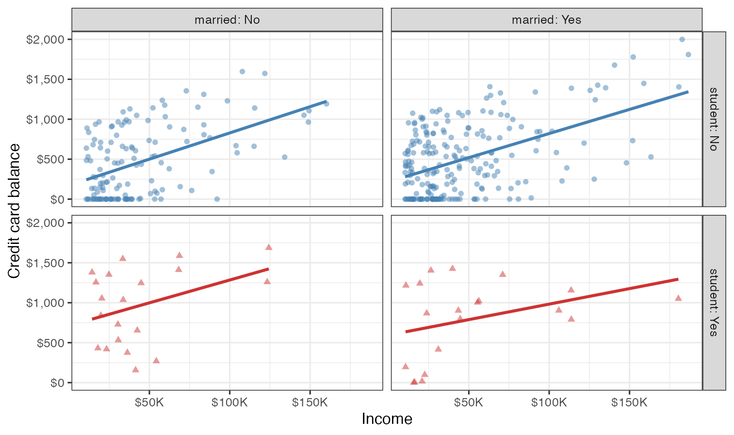
Recreate the following visualization. The only aspect you do not need to match are the colors, however you should use a pair of colors of your own choosing to indicate students and non-students. Choose colors that appear “distinct enough” from each other to you.
Then, describe the relationship between income and credit card balance, touching on how/if the relationship varies based on whether the individual is a student or not or whether they’re married or not.
Hints:
- Visualize the relationship between x (
income) and y (balance) for eachstudentandmarriedtype. - Pay attention to formatting of the labels in x and y scales.
- Note that this visualization doesn’t have a legend.
- For labels of facets that indicate the names of the variables along with their levels, see the
labellerargument of your faceting function, and specifically review the documentation and examples for thelabeller()function. - The theme of the plot is
theme_bw().
Exercise 5
Based on your answer to Exercise 4, do you think married and student might be useful predictors, in addition to income for predicting credit card balance? Explain your reasoning.
Exercise 6
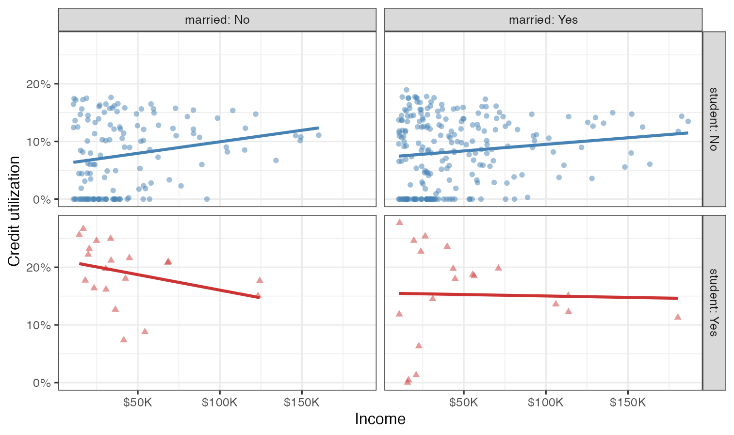
Credit utilization is defined as the proportion of credit balance to credit limit. Calculate credit utilization for all individuals in the credit data, and use it to recreate the following visualization.
Once again, the only aspect of the visualization you do not need to match are the colors, but you should use the same colors from the previous exercise.
Exercise 7
Based on the plot from Exercise 6, how, if at all, are the relationships between income and credit utilization different than the relationships between income and credit balance for individuals with various student and marriage status.
Now is a good time to render, commit, and push. Make sure that you commit and push all changed documents and your Git pane is completely empty before proceeding.
US counties
Exercises 8 and 9 use the county dataset in the openintro package. You can find out more about the dataset by inspecting its documentation with ?county and you can also find this information here.
Exercise 8
a. What does the following code do? Does it work? Does it make sense? Why/why not?
Code is grammatically correct but the plot is meaningless, it combines levels from two variables on the x-axis.
ggplot(county) +
geom_point(aes(x = median_edu, y = median_hh_income)) +
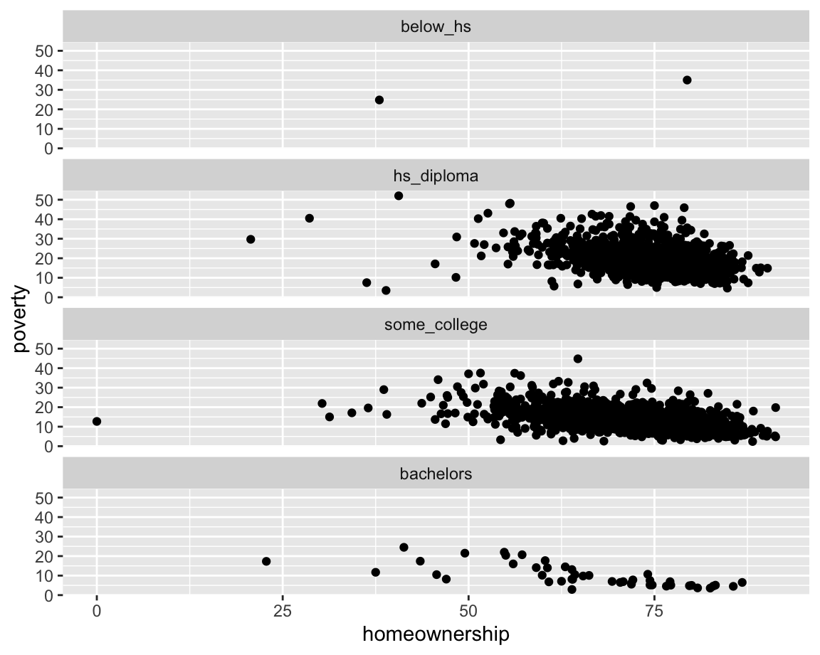
geom_boxplot(aes(x = smoking_ban, y = pop2017))b. Which of the following two plots makes it easier to compare poverty levels (poverty) across people from different median education levels (median_edu)? What does this say about when to place a faceting variable across rows or columns?
ggplot(county |> filter(!is.na(median_edu))) +
  geom_point(aes(x = homeownership, y = poverty)) +
  facet_wrap(~median_edu, nrow = 1)
ggplot(county |> filter(!is.na(median_edu))) +
  geom_point(aes(x = homeownership, y = poverty)) +
  facet_wrap(~median_edu, ncol = 1)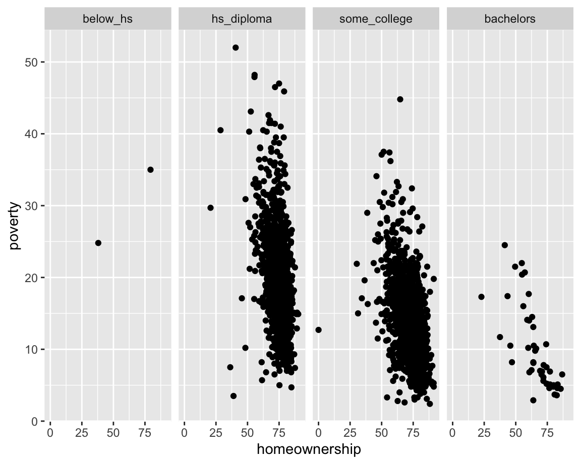
You know the drill: render, commit, and push!
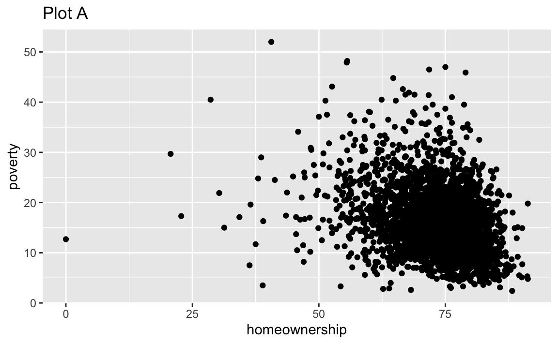
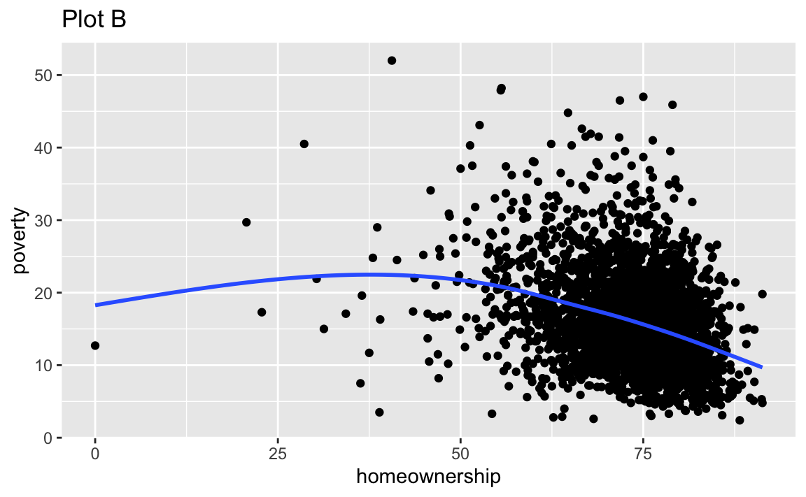
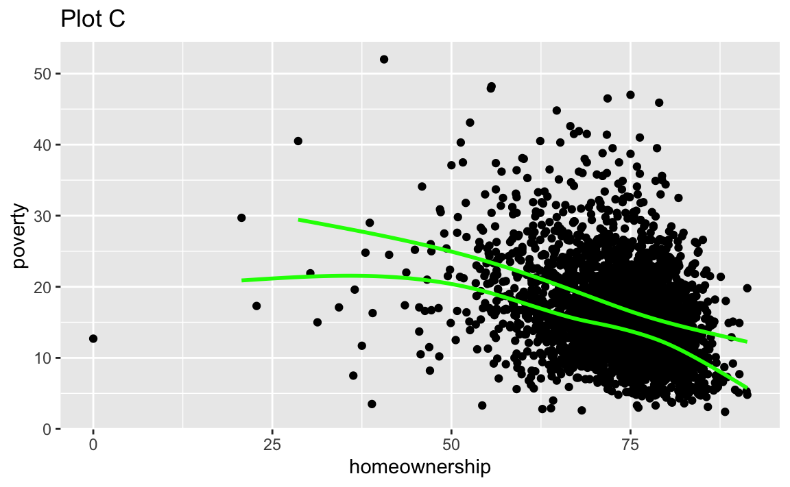
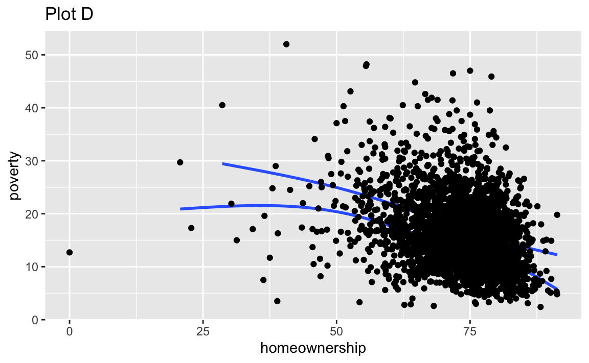
Exercise 9
Recreate the R code necessary to generate the following graphs. Note that wherever a categorical variable is used in the plot, it’s metro. You do not need to lay them out in a 2-column format.
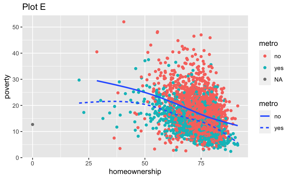
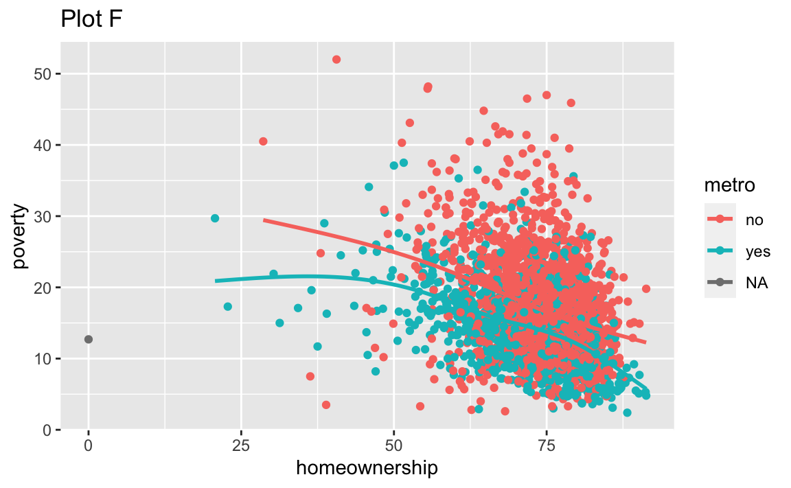
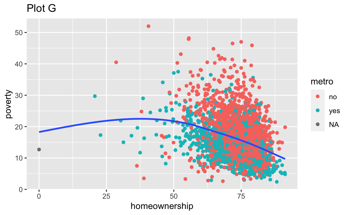

Render, commit, and push one last time.
Make sure that you commit and push all changed documents and your Git pane is completely empty before proceeding.
Wrap up
Review
Before you call it “done”,
- make sure you’ve answered all questions (or, at least, have not skipped any accidentally) and
- review the Section 1.2 section and make any edits/corrections needed.
You can change answers to exercises you’ve “completed” and commit and push again. We will only grade the final version of your assignment. You can commit and push as many times as you like until the deadline.
Submission
You do not have to do anything special to “submit” your assignment. We will close the repos to further pushes at the deadline, and will take your work as of that time point as your submission.
If you need to submit late for any reason, contact the professor.
Grading
- Exercise 1-9: 10 points each
- Workflow + formatting: 10 points
- Total: 100 points